You’ve been looking at Tableau for embedded analytics and data viz, but can your project management team benefit from the software as well? Sure, Tableau probably isn’t the first software system that comes to mind when you think project management, but you might be surprised by how useful it can be for visualizing the work you do in spreadsheets or lending more customizability to the reporting tools in your project management system.
But if you’re looking to get out of spreadsheets entirely, we can help. Use the Business Intelligence Product Selection Tool on our business intelligence software page to match with five different business intelligence vendors that we think you’ll love. For more tips on getting the most out of Tableau for your project management needs, read on.
Table of contents
- Building Gantt charts in Tableau
- Gaining deeper insight with donut charts
- Connecting your project management tool with Tableau
- Get more out of your project management data with the right business intelligence (BI) tool
[cta-two]Which business intelligence tool
is right for your organization?[/cta-two]
Building Gantt charts in Tableau
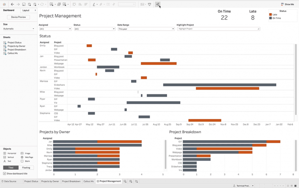
If you currently use spreadsheets for project management, the ability to build Gantt charts might be one of the more exciting prospects of using Tableau. Gantt charts have been a staple of project management since World War I, showing not only a list of tasks but also their estimated time to complete, progress, and interdependence on other tasks. Using Tableau, you can import data from spreadsheets to build helpful Gantt charts.
Also read: 16 Tableau Alternatives For Visualizing And Analyzing Data
Start by making an Excel sheet. You’ll want to make columns for team members, tasks, beginning and end dates, and date of completion. Next, import your spreadsheet to Tableau and start customizing it. You can either build the Gantt chart out manually by dragging and dropping dimensions to the appropriate rows and columns, or you can apply the Gantt Bar mark type to visualize your project.

From here, you can publish your visualization to Tableau Online, Desktop, or Public. You can also embed the Gantt chart wherever you want to so others can view and interact with it.
Also Read: Power BI vs. Tableau: A Data Analytics Duel
Gaining deeper insight with donut charts
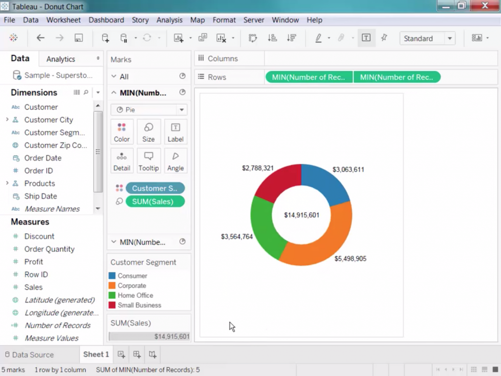
Donut charts are a favorite visualization among Tableau users, and it’s easy to see why. This slight improvement on the pie chart makes a great addition to almost any dashboard you’re working on, showing you quick snapshots of revenue goals, marketing signup sources, and more.

You can also use them to track project management stats. Here are some ideas of the different ways you can use donut charts for project management:
- Display late versus on-time tasks
- See how close individual team members are to completing their tasks
- Identify unassigned versus assigned tasks
- View individual team members’ bandwidth based on the number of tasks they’ve been assigned
- Get a snapshot of your project portfolio’s health by seeing how many projects are running on-time or on-budget
Once you start using Tableau for more project management-related uses, you’ll probably start to identify other areas where donut charts can be helpful. Also take into consideration who will be able to see these donut charts. Will only project managers be able to see which team members are making better progress than others? Could this visualization be used to encourage some friendly competition among team members?
Connecting your project management tool to Tableau
But what if you don’t use spreadsheets for project management? Many companies use project management software applications like Wrike, Microsoft Project, or Monday.com, but for this example, we’ll take a look at Tableau’s integration for Asana.
Asana is one of the most popular project management tools on the market. And while it does offer some of its own reporting features, you may want to import your Asana data into Tableau. Doing so allows you to create more customized views or to more easily share a project’s status with stakeholders who don’t have an Asana seat. To import your data in Asana to Tableau, Asana Business and Enterprise customers can easily add Asana as a web data connector by copying and pasting Asana’s web data connector URL into Tableau.

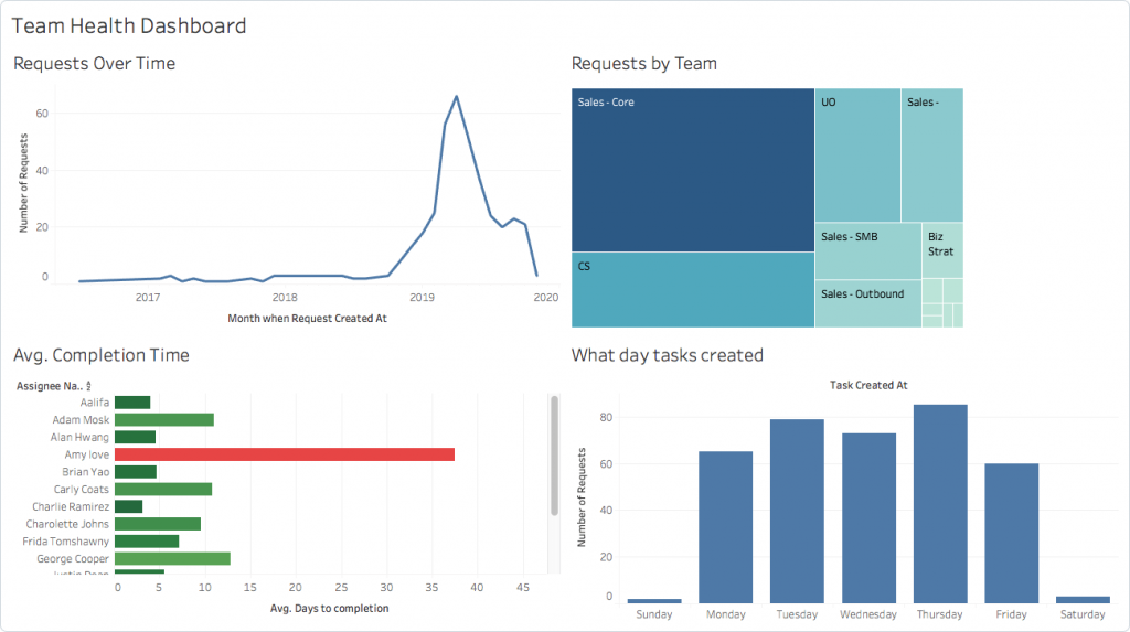
From there, you can create multiple visualizations using your Asana data. This is especially useful if you use custom fields in Asana or if you want to foster more collaboration between departments. (Note: Not all Asana data — like task dependencies — is available for use in Tableau.)
Asana isn’t the only project management tool that integrates with Tableau. If you use project management software, check your tool’s documentation to see if it supplies a web connector URL. In many cases, project management tools will also let you export data as a CSV or JSON file, which you can then import to Tableau for reporting and visualizing.
Get more out of your project management data with the right business intelligence (BI) tool
Tableau is a market leader when it comes to reporting and data visualization, but it isn’t the only one that can help you dig deeper into your project management data. Use the BI Product Selection Tool on our business intelligence software page to get free recommendations on which applications will work the best for you. In less than five minutes, we’ll ask you some questions to discover what specifications are most important to you, then we’ll send you a free shortlist of BI vendors that match your needs the best.


