Data insights have tremendous impact on business. And any edge you can find to better identify those insights should be taken at the first opportunity. Dashboards and reports are powerful mechanisms for driving insight, but what I’m going to dive into today — and what may be more important than both those elements combined — are data visualizations.
I’ve put together 5 data visualization best practices you need to follow if you want to create meaningful data visualizations that drive home your point and unearth hidden data insights.
 While we may look at a company-wide dashboard once a month, we’ll look at a dashboard that charts our own progress against our personal KPIs every day. You can boost that endorphin rush by plotting data visualizations that show how individual contributions drive the business’s success and progress toward larger goals.
If you want to engage your colleagues with data visualizations, choose metrics, charts, and graphs that show progress toward personal goals and contributions to organizational success.
In addition to engaging with and appealing to the viewer on a more self-centered level, it’s important the data visualizations you ultimately select engage users with their core functionalities. It’s not enough to simply slap a tailored visualization on a dashboard. Savvy users will still want to further engage with their data by interacting directly with it to drill-down or -up into data, view animations, or brush data. These users may even want the flexibility to display a different data visualization than what was originally presented.
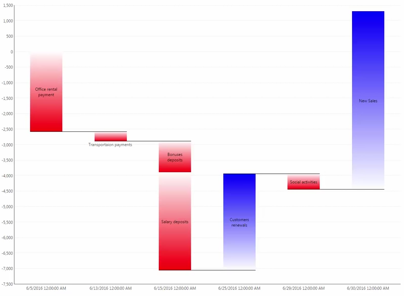 For example, a waterfall chart like the one above can quickly convey business income versus payouts, daily and hourly stock price movements, or monthly energy expended versus energy stored. Your audience will understand this data better and more clearly when you use a waterfall chart rather than a table. Put this same data into a pie chart or line graph, and you run the risk of misleading the viewer.
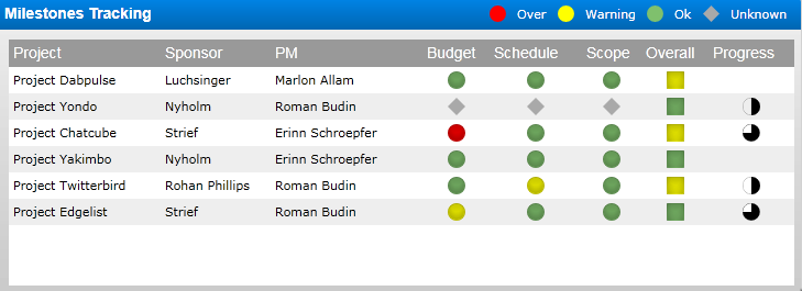 It’s one thing to show the total revenue number for Q4. It’s an entirely different thing to show that the revenue for Q4 is up 150 percent from Q2, or (gasp!) down 30 percent from Q3. A dashboard with a single graph on it is merely a fancy graph, not a dashboard.
Figure out the story that you want to tell with your data visualizations — pipeline to sales won, development projects shipped to production while maintaining the current codebase, customer satisfaction per product delivered — and include the most relevant stats that complete the story. Include both high-level metrics and more detailed information in a single dashboard to give context.
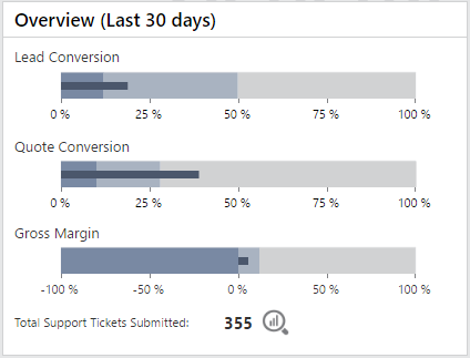 While we could use data visualizations to impart a novel’s worth of information, most people only need a haiku for everyday use. And while we have the ability to understand multitudes — the human brain is the most advanced pattern recognition technology on the planet — our brains only process a fraction of what we see. You want your reports, dashboards, and visualizations to surface the most important information with the least mental friction. A bullet chart, pictured above, shows several key metrics all in a single chart.
This means building attractive, easy-to-understand visualizations that tell a story in a small space. Think of it like an infographic for your data.
1. Data visualizations should be engaging.
You might consider data inherently engaging if you spend one third of your week thinking about data like I do. But that excitement can easily get lost on the average dashboard viewer. In order for data to be engaging, it has to be relevant to the individual viewing it, which means that data visualizations by extension have to be personalized. We’re all self-centered in this way. A sales leaderboard or a top-support-tickets-closed leaderboard is a fast way to show individual progress toward company success. While we may look at a company-wide dashboard once a month, we’ll look at a dashboard that charts our own progress against our personal KPIs every day. You can boost that endorphin rush by plotting data visualizations that show how individual contributions drive the business’s success and progress toward larger goals.
If you want to engage your colleagues with data visualizations, choose metrics, charts, and graphs that show progress toward personal goals and contributions to organizational success.
In addition to engaging with and appealing to the viewer on a more self-centered level, it’s important the data visualizations you ultimately select engage users with their core functionalities. It’s not enough to simply slap a tailored visualization on a dashboard. Savvy users will still want to further engage with their data by interacting directly with it to drill-down or -up into data, view animations, or brush data. These users may even want the flexibility to display a different data visualization than what was originally presented.
2. Data visualizations should be stunning.
Data visualizations should surprise and delight their users. We’ve come to expect dashboards, reports, and embedded analytics to give us timely and valuable data, but data visualizations haven’t always held up their end of the bargain. Data visualizations aren’t always beautiful, and they don’t necessarily match your company’s branding. That needs to change. To create stunning data visualizations for internal stakeholders:- Consider adding interactivity to your visualizations to give individuals control to manipulate data according to their questions and their particular understanding of the metrics.
- Make sure the data you use tells the right story. Incorrect data misleads your audience from the beginning.
- Follow your company’s branding guide and use similar fonts, colors, and spacing as your other customer-facing or internal assets.
3. Data visualizations should be well-selected.
You wouldn’t use a screwdriver to nail down roofing shingles. Hopefully, you’d use a hammer, or a nail gun. Choosing the right visualization for the job is just as important. The right visualization is the difference between instant understanding and confusion. People have been using data visualizations for hundreds of years, so we can go beyond basic visualizations like the fuel gauge, line chart, or pie graph. While these can convey meaning, they don’t tell the whole story. At best they may leave some information out of the data story, and at worst they tell the wrong story. For example, a waterfall chart like the one above can quickly convey business income versus payouts, daily and hourly stock price movements, or monthly energy expended versus energy stored. Your audience will understand this data better and more clearly when you use a waterfall chart rather than a table. Put this same data into a pie chart or line graph, and you run the risk of misleading the viewer.
4. Data visualizations should be contextually relevant.
What if I told you that giraffes have seven bones in their neck? That fact on its own isn’t all that interesting. Now what if I told you that all mammals (minus manatees and sloths) have seven bones in their neck, and the size of each vertebra is what actually makes a giraffe’s neck so long? Knowing that my own short neck — even for a mere human — contains the same number of bones as a giraffe tells many stories. The same goes for any metric or visualization you decide to include on your dashboards. It’s one thing to show the total revenue number for Q4. It’s an entirely different thing to show that the revenue for Q4 is up 150 percent from Q2, or (gasp!) down 30 percent from Q3. A dashboard with a single graph on it is merely a fancy graph, not a dashboard.
Figure out the story that you want to tell with your data visualizations — pipeline to sales won, development projects shipped to production while maintaining the current codebase, customer satisfaction per product delivered — and include the most relevant stats that complete the story. Include both high-level metrics and more detailed information in a single dashboard to give context.
5. Data visualizations should be snackable.
Data visualizations have the advantage of relaying meaning through the combined power of numbers, words, spatial comparisons, colors, and images. That’s a lot of power for one little dashboard. While we could use data visualizations to impart a novel’s worth of information, most people only need a haiku for everyday use. And while we have the ability to understand multitudes — the human brain is the most advanced pattern recognition technology on the planet — our brains only process a fraction of what we see. You want your reports, dashboards, and visualizations to surface the most important information with the least mental friction. A bullet chart, pictured above, shows several key metrics all in a single chart.
This means building attractive, easy-to-understand visualizations that tell a story in a small space. Think of it like an infographic for your data.


